State of HealthJoy
As 2022 is coming to an end, we want to take a look back at this year and recap all of the exciting news and progress that HealthJoy has made. It’s...
Connected Navigation Platform
Guiding to high-value care
Behavioral Health
Foster a mentally healthy workplace
EAP
Supporting holistic wellbeing
Virtual MSK Care
Reimagining musculoskeletal care
Virtual Primary Care
Powered by smart navigation
Surgery Centers of Excellence
Best-in-class surgical outcomes
Virtual Urgent Care
Immediate care, any hour of the day
Chronic Care
A new approach to chronic care
Integrations
Flexible to any strategy

Today I’m thrilled to debut the completely updated HealthJoy 2.0.
We’ve been working on the all-new version of HealthJoy for the last two years. It represents around-the-clock work from our talented team of developers, and I am so proud of what they’ve accomplished in this redesigned experience.
The changes made in HealthJoy 2.0, especially those on the back end, lay the technical foundation to continue to fulfill our vision of removing the complexity from being healthy.
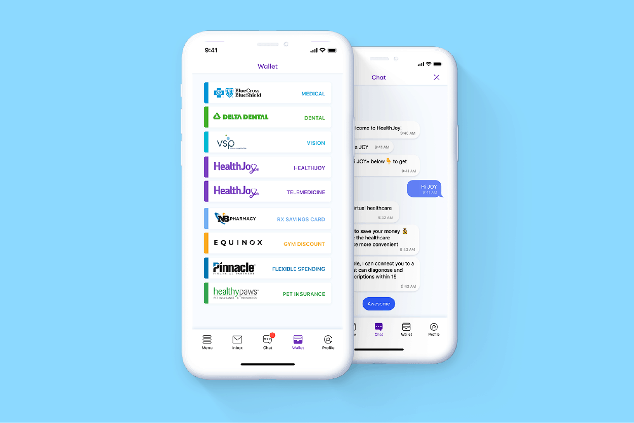
Having said that, the visible improvements to the user interface that you’ll notice when opening the app are significant and, I have to say, delightful. You’ll experience a completely new design that’s airy, easier to read, and feels magical. Improvements to navigation, chat, and our inbox makes the HealthJoy app a true joy to use.
In this post, we’ll cover the most significant changes to the front end of HealthJoy. We’ll feature an in-depth look at backend changes in an upcoming blog post.
HealthJoy 2.0 includes a bottom navigation bar that makes it easier to find everything you’re looking for in a snap. For example, you can now jump from the middle of a chat into your benefits wallet and back. You can seamlessly keep chatting the whole time with a concierge. We’ve also heard loud and clear from our members that you want one-click access to our menu for immediate access to all our services. You’ll love our new tab bar.
When you submit a member service request, you will see more information as our concierge team works to complete your request. We want to make these cards clear and transparent, so requests will now include the name of the person for whom the service request was made and the estimated time of delivery. When you tap an “in-progress” card, you’ll see details about the status of your request. We’ve added buttons to help you cancel your request, and to keep your inbox tidy, you can also archive your requests after they’re received.
Your new and improved profile can be updated for a more personal experience. We’ve made it possible to add a photo (handy in chats), change your contact email, and leave us your direct feedback. You can also see family member data from within your profile. We’ve also enhanced security so you can enable a passcode or Face ID lock and feel extra confident with the safety of your personal data. We know these features are something our members expect from their favorite apps, and adding them makes the experience more personal and enjoyable.
You’ll notice the HealthJoy 2.0 chat experience is quite an upgrade from our previous version. We’ve added new features to make our chats more transparent. The text selectors for prepopulated text are easier to use, and you can now ask questions as free form text to initiate a new text. You can see the name and photo of the HealthCare concierge (HCC) with whom you’re chatting, for that personal touch. You’ll also see a timer indicating how long it takes the HCC to join you in a chat. Finally, we’ve made it possible to upload files from iCloud, Dropbox, Google Drive, locally from your device, and to add photos from your gallery. This makes it simpler to upload your bill or Explanation of Benefits (EOB) when submitting a bill review, for instance.
Of course, those are just the visible changes. The user interface updates will be the first thing you notice, but the backend changes are actually what I’m most excited about. On the back end, HealthJoy’s architecture, which consists of the app, a custom customer relationship management (CRM) system, a dashboard for HR, custom application program interfaces (APIs), and a wide variety of databases, has been completely redesigned as well. While you might never see these updates, you’ll notice the app is now faster, more stable, and uses less battery. These changes will help us with our mission to guide our members to affordable, high-quality healthcare. The new HealthJoy 2.0 will be released in a staged rollout beginning today, and we can’t wait for you to experience it. We’ll explain our backend changes in an upcoming post in more detail. If you’d like to nerd out about that, stay tuned.
Schedule a demo to see how HealthJoy 2.0 can help employees find affordable, high-quality healthcare and more.

As 2022 is coming to an end, we want to take a look back at this year and recap all of the exciting news and progress that HealthJoy has made. It’s...

At HealthJoy we are always looking for ways to make the healthcare experience simpler for our members. That’s why we are taking our provider,...
The team at HealthJoy is excited to announce that we have a new Chief Operating Officer (COO), Brad Aaron. Brad brings 20 years of operational...